Making Model-Driven Apps Awesome: Easy Tips for Happy Users

Hey there, fellow developers! Do you want to make sure people love using your model-driven apps, right? Me too! So, I decided to gather some tips and tricks to do that. Let’s break it down in simpler terms.
1. Know Your Users
First things first, understand who’s going to use your app. What do they like? What do they need? Talk to them, ask questions, and pretend you’re them for a while. This way, you can make an app that feels like it was made just for them.
2. Keep it Simple to Get Around
Think of your app as a map. You want it to be easy for people to find their way. Organize things logically, use buttons and menus that people recognize, and add search bars to help them find stuff faster.
3. Make Sure Everyone Can Use It
Not everyone uses apps the same way. Some people might have trouble seeing, hearing, or moving around. Make sure your app works for everyone by using clear text, big buttons, and letting people use keyboards instead of just mouse clicks.
4. Speed Things Up
Nobody likes waiting forever for an app to do its thing. Make sure your app runs smoothly and doesn’t take ages to load. Use clever tricks to make it work faster, even if someone’s using it on an old phone or with a slow internet connection.
5. Let People Make It Their Own
Everybody’s different, right? So, let people change things up a bit. Let them pick colors, move stuff around, and choose what they want to see. This will make users feel like the app was created specifically with them in mind.
6. Give a Helping Hand
Sometimes, people get stuck and need a little help. Add little tips and guides to show them what to do. Think of it as having a friendly assistant right there to answer questions and show them around.
7. Listen Up and Make Changes
Last but not least, listen to what people say about your app. If they love something, do more of it. If they hate something, change it up. Keep making your app better and better based on what people tell you.
Now I would like to start with one of the tricks that I have found useful to me: determine what will be helpful for users when they fill out the form.
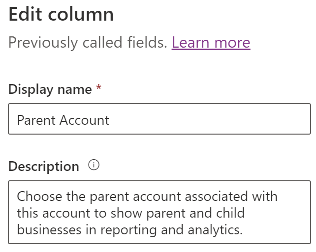
- Make sure to give each field a clear name that tells users what kind of data to enter. When users hover over the field name, a tooltip should appear to include additional details about the field.

- When you’re adding a new field, write a helpful description to explain what it’s for. Users can read this description whenever they hover over the field name.

Those are the tips I have for now, but I’ll be sharing more later on! Keep it simple, keep it fun, and keep making awesome apps!


