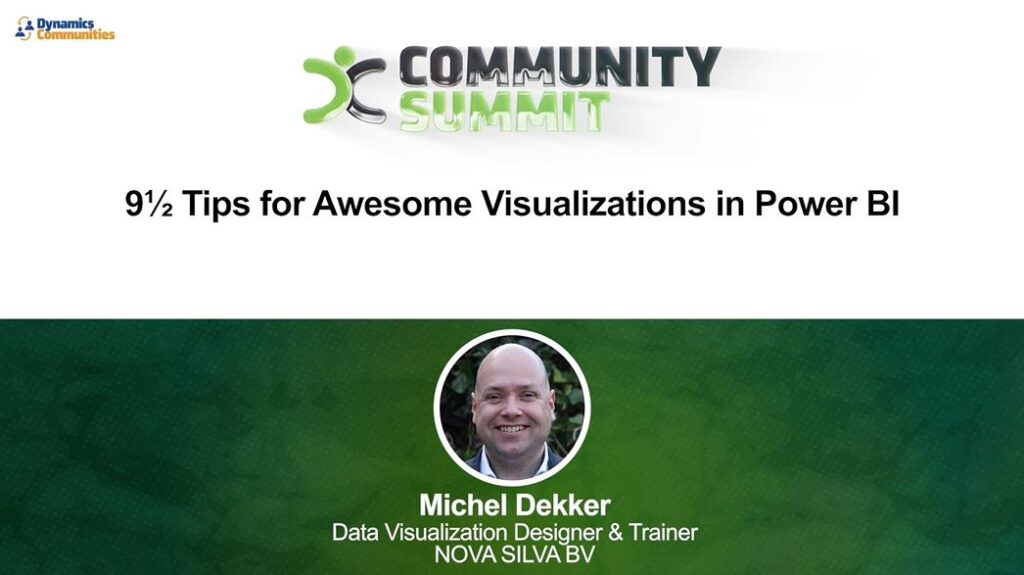
9½ Tips for Awesome Visualizations in Power BI

How do we translate our data into something we (humans) can understand? The answer is data visualization, although a lot of the data visualizations are unfortunately not optimized for human consumption. Let’s stop wasting valuable time. You’ll learn how to recognize misleading data visualizations and how to avoid them. Based on practical examples you’ll learn 9½ tips for awesome visualizations in Power BI. You can instantly apply them to all your Power BI reports and dashboards.

