Play Axis and Bar Charts
-
Play Axis and Bar Charts
Posted by DSC Communities on August 23, 2018 at 10:12 am-

John Flannery
MemberAugust 23, 2018 at 10:12 AM
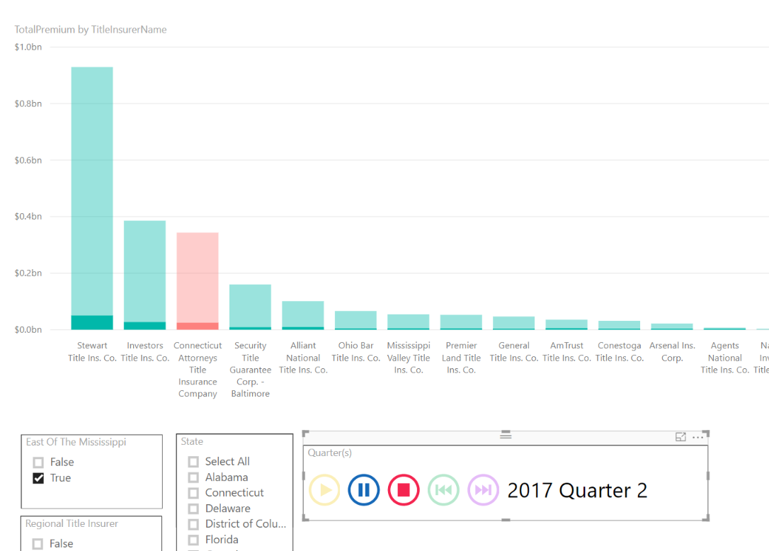
Folks:I have a bar chart within Power BI that shows Market Share. I have quarterly snapshots of that data. I want to use Play Axis to produce an annotation. Installing it was pretty straight forward. But what I am getting when I run the thing is – the gross or overall market share chart just dithers out a bit, and the contribution of the particular quarter currently in Play Axis focus is highlighted. (See the included graphic.)
That’s not the behavior I am after. I started with a Year – Quarter slicer. (Which I am replacing with play axis.) In that slicer – if I were to select a quarter – the chart would reflect that quarter. If I select a new quarter – the entire chart adjusts. And most importantly – if the order of companies I am tracking changes for that particular quarter – the order of the bars changes as well. That is the behavior I want from play axis. Any ideas how to achieve this?
——————————
John Flannery
Data Architect——————————
-

Sean Graham
MemberAugust 24, 2018 at 2:59 AM
Hi John,
I think I know what you are requiring but excuse me if I am wrong 🙂In Power BI Desktop, select the play axis visualisation.
Then from the menu click Format > Edit Interactions.You then should see on all your other visualisations (column chart etc.) interaction buttons along the top :

The default selection will be highlight which means it will still show all values and just highlight the values from your filter.
Change this to the Filter selection (funnel).
Now try the play axis again.Thanks,
Sean
——————————
Sean Graham
BI Consultant
Dublin
——————————
——————————————- -

John Flannery
MemberAugust 24, 2018 at 3:20 PM
Sean:Thank You!!! That is exactly what was needed.
One more question. The animated tab is s clone of another tab in Power BI that has a quarterly slicer. The slicer is ordered 2018Q1, 2017Q4, 2017Q3 yada yada yada so that the most recent time period is on top of the slicer.
After I plugged in your fix – I got exactly the behavior I wanted with one exception. The animation runs backwards. It starts at 2018Q1 and goes backwards from there.
How can I tell it to reverse direction?
——————————
John Flannery
Database Architect——————————
——————————————- -

John Flannery
MemberAugust 24, 2018 at 3:33 PM
OK – Two questions.When the animation is sitting idle, it displays the total market share for all time. Basically aggregating the market share from all the years I have data. I don’t want that. I want the default to simply be data from the most recent quarter. And – when the animation completes (I do not have it in a loop) I want the data from the most recent quarter to remain in the display.
So I want to accomplish two things:
- I want the play axis to run from oldest to newest (today it runs newest to oldest)
- I wast the chart to default to the most recent quarter when the animation is not running.
This is going to really help me out If I can get this working. I appreciate greatly your help here.
——————————
John Flannery
Data Architect
CATIC
Rocky Hill, CT
——————————
——————————————- -

Sean Graham
MemberAugust 28, 2018 at 3:41 AM
Hi John,
Sorry only getting back to you now. Busy yesterday 🙂Answer to first question :
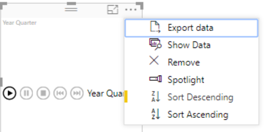
In your play axis you will see 3 dots in top right hand corner. Click this and then choose ‘Sort Descending’. This will reverse the play :

Answer to second question :All depends on how Date table is setup and if Year and Quarter combined is a measure on the query/table.
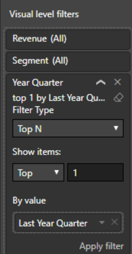
If it is a measure then you could apply a Top 1 Filter to the visualisation (your column chart for example) similar to below :If it is not a measure then we could go about it a different way. Are dates in a separate query on your dataset or do you have market share and dates with years and quarters all in the one query?
Thanks,
Sean
——————————
Sean Graham
BI Consultant
Dublin
——————————
——————————————- -

Richard Gratz
MemberFebruary 9, 2020 at 5:03 AM
Hello Sean,I am quite new to powerBI and I would like to achieve basically the same as described above by John. I have already only the requested years visible in the graph. However the chart fails to default to the most recent year when the animation is not running. I have the year in the same table with the rest of the data and is not a measure. Would you please know, how to approach this, if I want also only the latest year to be shown on the graph instead of all the years aggregated once the animation stops?
Thanks a lot!
Best,
Richard——————————
Richard Gratz
——————————
——————————————- -

Kumail Raza
MemberAugust 24, 2018 at 11:31 AM
Hi John,Probably Sean got you requirement correctly, however, if there is some thing else, could you send file with sample data?
Regards
——————————
Kumail Raza
Business Analyst | BI | Analytics Practitioner
tag.kumail@gmail.com
——————————
——————————————-
DSC Communities replied 7 years ago 1 Member · 0 Replies -
-
0 Replies
Sorry, there were no replies found.
The discussion ‘Play Axis and Bar Charts’ is closed to new replies.


