
Power Platform
Power Platform
Organizer:
- JOSE Organized by
-
-
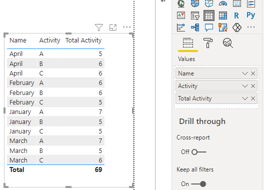
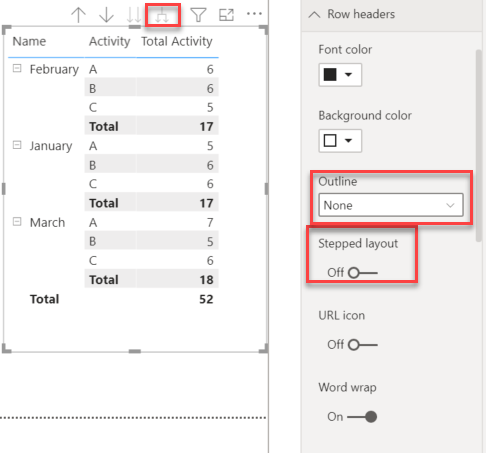
Need to create a table, matrix or multi-row card.
-
Need to create a table, matrix or multi-row card.
Sorry, there were no replies found.
The discussion ‘Need to create a table, matrix or multi-row card.’ is closed to new replies.