How do I turn a report into a chart?
-
How do I turn a report into a chart?
Posted by DSC Communities on March 31, 2017 at 4:10 pm-

Tyler Jensen
MemberMarch 31, 2017 at 4:10 PM
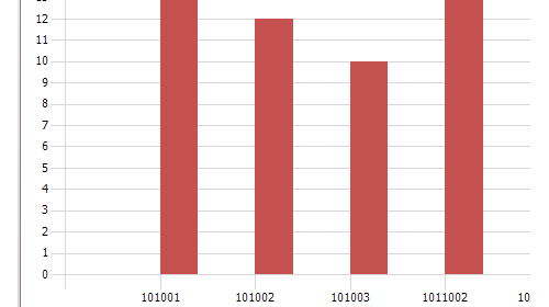
We have a created report and I would like to turn that into a chart to display in the role center. We are in Nav 2013R2, How would I go about doing that?——————————
Tyler Jensen
Marshall Wolf Automation
Algonquin IL
—————————— -
Go to Administration/Application Setup/Role Tailored Client/Generic Chart to bring up the list of charts. Click on new to open the chart setup. Give the chart an ID and name. then set the Source Type to Report and the Source ID to the ID of the report you want. Then you will need to set the various measures and X and Y settings. After completion, you should be able to bring it into a chart part on your role center.
——————————
Dave Wiser
Controller
Beckwith & Kuffel
Seattle WA
——————————
——————————————- -

Rick Baxter
MemberApril 3, 2017 at 7:58 AM
The Generic Charts are a great tool for displaying data with in NAV. The best part it is a FREE Tool that comes with your software, but you do need some training to use all the aspects of the Charting Tool. I have created a very inexpensive course on this very topic. You can see the content from this link: Charting Made Easy for Dynamics NAV – 1 Year Access (1 User)Cost Control Academy remove preview 
Charting Made Easy for Dynamics NAV – 1 Year Access (1 User) Learn how to build your own Generic Charts in Microsoft Dynamics NAV View this on Cost Control Academy > Check it it at the link above.
——————————
Rick Baxter
Business Development
Cost Control Software, Inc.
Carmel IN
——————————
——————————————- -

Tyler Jensen
MemberApril 3, 2017 at 12:04 PM
Thanks Rick, I will take a look into that.——————————
Tyler Jensen
Marshall Wolf Automation
Algonquin IL
——————————
——————————————- -

Tyler Jensen
MemberApril 3, 2017 at 12:03 PM
For source type my only two options are table and query, no report.——————————
Tyler Jensen
Marshall Wolf Automation
Algonquin IL
——————————
——————————————- -
Sorry about that. You’re right, they are not available for reports. Look to AJ’s response for more insight.
——————————
Dave Wiser
Controller
Beckwith & Kuffel
Seattle WA
——————————
——————————————- -
Hi Tyler,
To my knowledge, there is no simple way to build a chart for the Role Center from a Report Object. As you have correctly noted (in response to Dave’s help), you cannot create Generic Charts for the Report Object type.
The Role Center supports Generic Charts (which do not support Reports), Finance Performance Charts (which are generated from Account Schedules), Sales / Purchase Performance Charts (which are generated from Sales / Purchase Analysis Views), and Trailing Sales Order Charts.
You may be able to accomplish what you’re looking to do with some coding, but I doubt there’s any out of the box functionality along those lines.
That said, if you want to build charting INTO your NAV Reports, that is very much possible: https://msdn.microsoft.com/en-us/dynamics/nav/dn833443.aspx
I hope this helps.
-AJ
——————————
AJ Ansari
NAV Product Manager
InterDyn BMI
Houston TX
——————————
——————————————- -

Tyler Jensen
MemberApril 3, 2017 at 2:56 PM
Hi Aj,
Can I replicate the report as a page and try to go that route?——————————
Tyler Jensen
Marshall Wolf Automation
Algonquin IL
——————————
——————————————- -
Hi Tyler,
You certainly can.
1. Create a table with fields matching the columns of output that your report generates. For best result, ensure that the fields in this table have the same datatypes / length as the fields (or expressions) from the report. Create a List type page for this table so you can easily view this table’s data.
2. In your report, instead of (or alongside) having the output being written to a Report Layout, have the report write records to this table. You’ll need to decide what happens when you re-run the report (append records to what’s already in the table – which could lead to duplication, or wipe that table clean each time you run the report and re-populate the results from the report run to the table).
You can even add factboxes and charts to this new page from Step 1, to add more value to the page you’ve created. But, that’s beside the point of this question/thread.
3. Build your Generic Chart(s) from this table, and add this Chart on your Role Center.
Quick Note: Generic Charts only work in the Windows Client, and are not supported in the Web Client.
I hope this helps!
——————————
AJ Ansari
NAV Product Manager
InterDyn BMI
Houston TX
——————————
——————————————- -

Tyler Jensen
MemberApril 4, 2017 at 11:46 AM
That is what I originally tried. Where I got stuck the C/AL code. There aren’t just fields for me to pull from. There are at least 12 if statements, plus some different buffers, filters, and buffer fields.——————————
Tyler Jensen
Marshall Wolf Automation
Algonquin IL
——————————
——————————————- -
That doesn’t sound fun at all. Perhaps it’s time for a second set of eyes from your development team or partner to streamline that code.
——————————
AJ Ansari
NAV Product Manager
InterDyn BMI
Houston TX
——————————
——————————————-
DSC Communities replied 8 years, 5 months ago 1 Member · 0 Replies -
-
0 Replies
Sorry, there were no replies found.
The discussion ‘How do I turn a report into a chart?’ is closed to new replies.


