
Power Platform
Public Group
Active a day ago
Power Platform
Organizer:
- JOSE Organized by
-
-
Bell curve distribution in power BI
-
Bell curve distribution in power BI
Posted by DSC Communities on December 30, 2019 at 12:25 am-

Nilesh Kanojiya
MemberDecember 30, 2019 at 12:25 AM
Bell curve distribution in power BI from below data.I have project no., project start date & end date, project total hrs.
I want distribute total hrs in each month from start to end date.
example.
Project No. Project Start Date Project End Date Project Total Hrs. ABC123 1-Apr-19 1-Aug-19 1200
I wand out put as mention in belowOutput required bell curve distribution APR MAY JUN JUL AUG 180 240 360 240 180 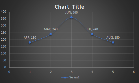
——————————
Nilesh Kanojiya
Sr.Developer
—————————— -
Unfortunately Nilesh, it’s not that simple. You can use the Norm.Dist() excel function, but without more data points it’s not going to graph well. In the example given, five is not enough. See the chart on the right – it is transparent. Overlay it onto the one to its left. The five points line up perfectly, but the curves have different shapes. One a clear normal distribution, the other not.
Step back – what are we trying to accomplish? Why the curve?
——————————
Jeff Nixon
Managing Director
——————————
——————————————- -
Nicolas MENDEZ
MemberJanuary 3, 2020 at 6:09 PM
Hi Nilesh,I think that reply is a good start because it gives a good bell shape, but to be more precise the use case is not really following a normal distribution? and some hours are not included in Jeff’s result. The total hours in jeff’s chart is different from the 1200 expected.
So I tried something based on Jeff’s idea and used the Norm.dist() function adding a correction to retrieves all the hours in the project.
Spent a few seconds (or a little bit more 😉 ) on your use case and you will find my idea attached.Jeff, Nilesh and others, feedback and improvements welcome..
——————————
Nicolas MENDEZ
Datanaut & Power Bi AddictFrance – Belgium – Netherlands – Luxembourg – Switzerland
——————————
——————————————- -
Jenya Zemlyanskaya
MemberJune 1, 2020 at 6:52 PM
Hi Nicolas,Do you mind sharing your file in the xlsx format?
I am trying to build a formula to bell-curve distribute project hours based on date range and go/get probabilities.Kind regards,
Jenya——————————
Jenya Zemlyanskaya
Project Controls Specialist
——————————
——————————————- -
Ben Howard
MemberJune 2, 2020 at 3:02 AM
I agree with Jeff, what’s the end goal. You’d have to define a standard deviation and a normal distribution to draw a curve, plus, I’ve never managed to get a nice “round” curve in Power BI, often just a pointy line. I did some investigative work into this a while back, Page 1 of https://app.powerbi.com/view?r=eyJrIjoiMTNkNmZiNmEtNTYzMC00ZjJhLWJjOGItNzAyYzVmYWU2MTBmIiwidCI6Ijc0Njk5M2JkLWI2OTMtNDVjOC04ZWMxLWY0NzU1YzRiNzI4YSIsImMiOjh9 gives an example of doing this using the standard line and column chart, page 3 uses a 3rd party visual.——————————
Ben Howard
——————————
——————————————- -
Zulfia Imtiaz
MemberAugust 24, 2020 at 6:08 PM
Hello Nicolas,I used the same steps (measures) as in your Power BI attachment, but the report generates a blank.
My dataset has ~100 rows with varying date ranges and hours to be spread in a bell curve. I did use the DimDates table to cover all the date ranges.I also tried filtering only for one project at a time.The report still returns a blank.
Appreciate your help!
——————————
Zulfia Imtiaz
Project Controls
——————————
——————————————-
DSC Communities replied 6 years, 1 month ago 1 Member · 0 Replies -
-
0 Replies
Sorry, there were no replies found.
The discussion ‘Bell curve distribution in power BI’ is closed to new replies.