
Power Platform
Power Platform
Organizer:
- JOSE Organized by
-
-
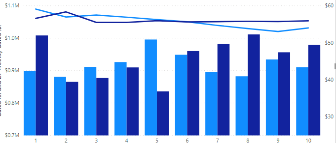
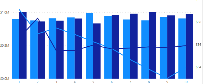
Auto Axis vs Filters
-
Auto Axis vs Filters
Sorry, there were no replies found.
The discussion ‘Auto Axis vs Filters’ is closed to new replies.
Power Platform
Sorry, there were no replies found.
The discussion ‘Auto Axis vs Filters’ is closed to new replies.
Please confirm you want to block this member.
You will no longer be able to:
Please note: This action will also remove this member from your connections and send a report to the site admin. Please allow a few minutes for this process to complete.